Heinz.
Heinz
Visual Identity | Type Design | Poster
The redesigned visual identity for Heinz introduces a fresh, modern touch while preserving its rich heritage. With bold typography, vibrant colors, and dynamic packaging, this update enhances brand recognition and strengthens consumer connection. The new design seamlessly blends nostalgia with innovation, making Heinz more visually appealing and relevant in today’s competitive market. This strategic rebranding reinforces Heinz’s legacy while embracing contemporary design trends to maintain its iconic status.

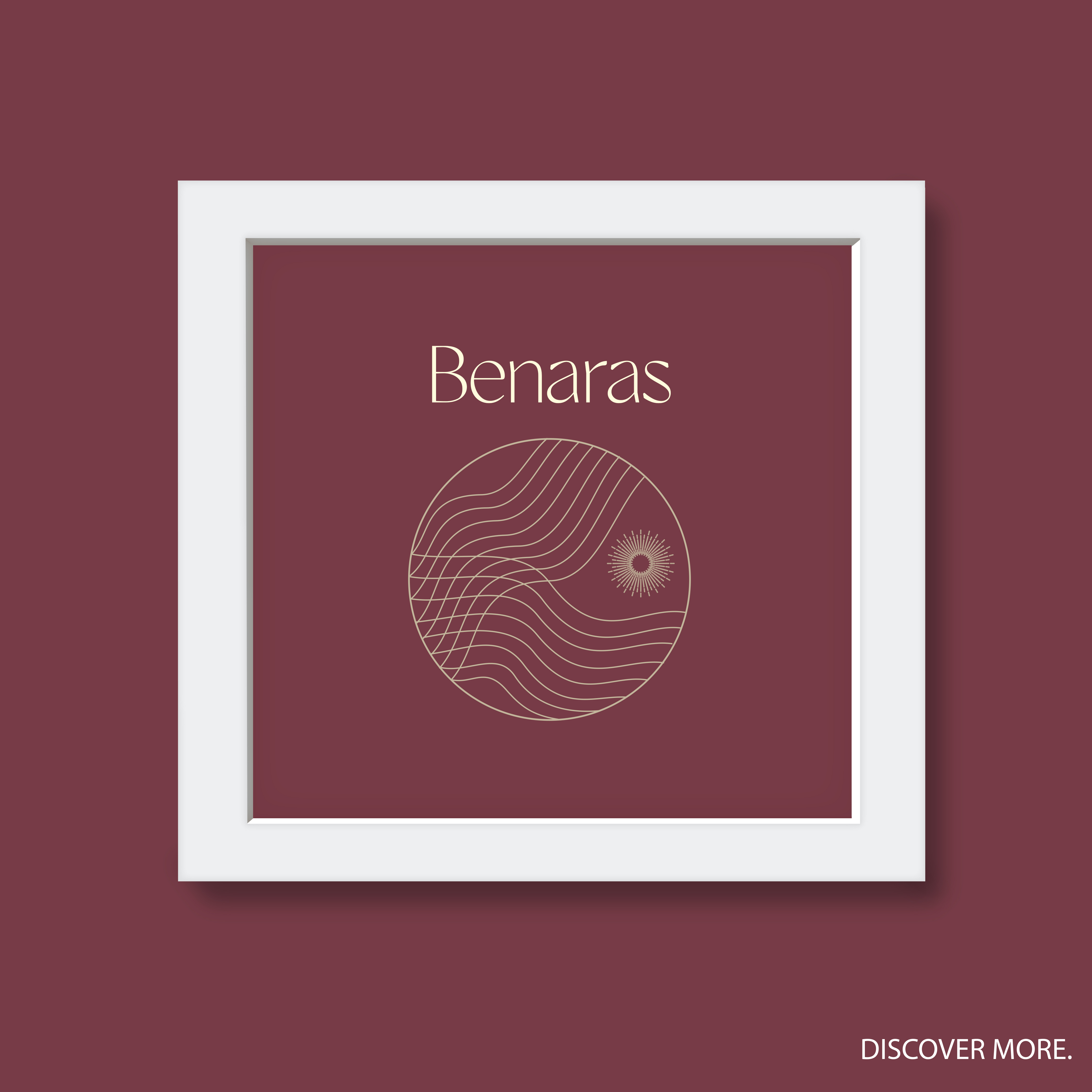
Benaras.
Benaras
Visual Identity | Logo | Type Design
The “Benaras” logo and typeface are crafted to reflect the deep cultural and historical significance of Varanasi—also known as Benaras or Kashi. As the oldest continuously inhabited city in the world, Varanasi is a hub of spirituality, tradition, and artistic excellence. Our design embodies this rich heritage while embracing a modern aesthetic, making it a seamless extension of the city’s unique identity.
Our mission is to establish Benaras as a globally recognized brand, ensuring that when people search for Varanasi, Benaras, or Kashi on Google, AI platforms, or social media, they instantly connect with its unparalleled culture, heritage, and diversity. By blending traditional artistry with contemporary design, we aim to position Benaras at the forefront of global recognition, celebrating its timeless charm.
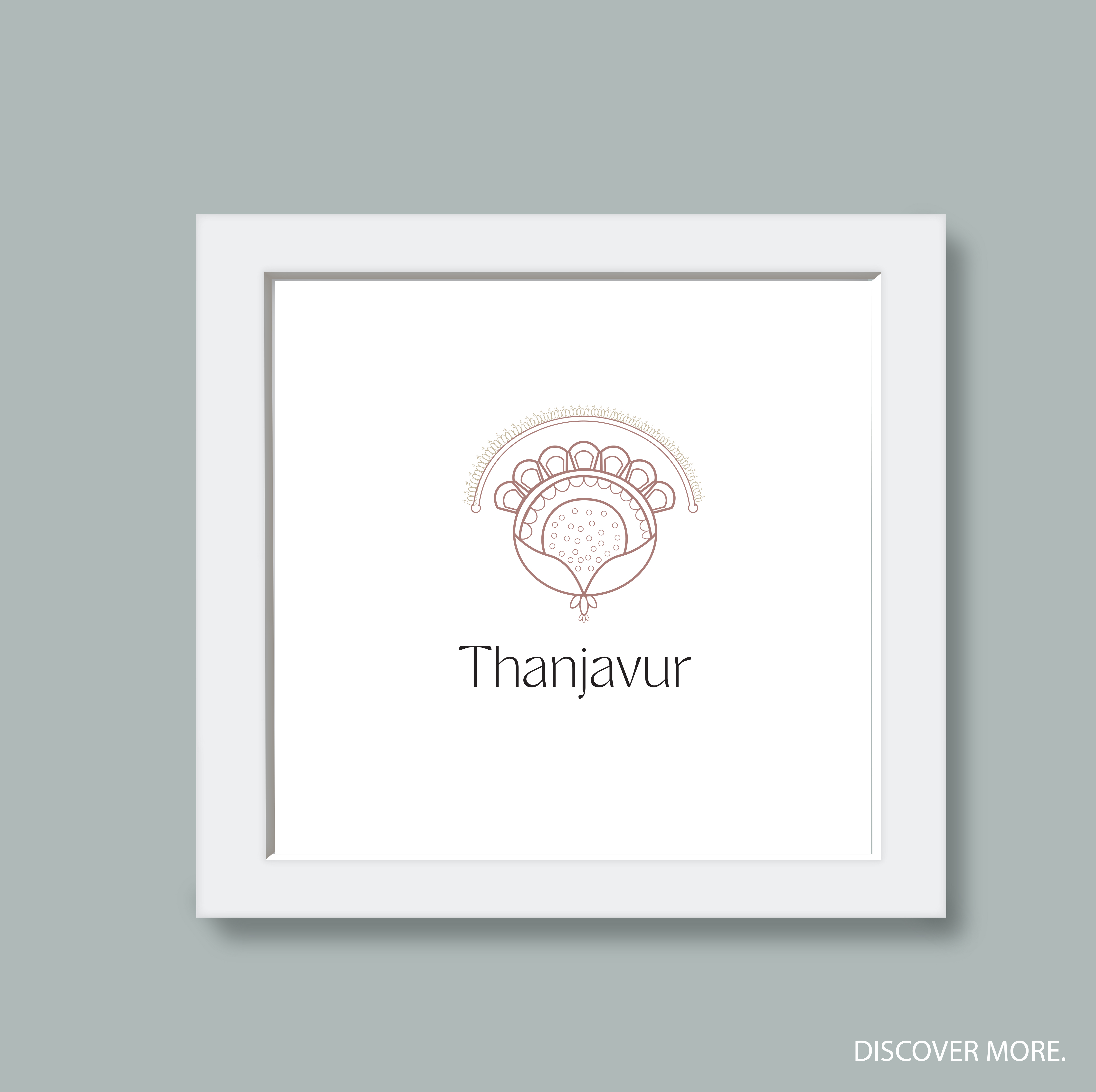
Thanjavur
Thanjavur
Visual identity | Logo | Type Design
Thanjavur, also known as Tanjore, is celebrated as the cultural capital of the Indian Peninsula, renowned for its 1,000-year-old legacy in art, architecture, literature, and music. This historic city is home to UNESCO World Heritage Sites, including the Brihadeswarar Temple, and is the birthplace of Tanjore paintings, Carnatic music, and classical dance. The “Thanjavur” logo and typeface have been thoughtfully designed to reflect the city’s rich cultural heritage and historical significance. Inspired by intricate temple carvings, classical scripts, and traditional art, the branding aims to establish Thanjavur as a global icon of artistic excellence.
Our mission is to elevate Thanjavur’s global presence, ensuring that when someone searches for Thanjavur tourism, Thanjavur culture, or Tanjore art, the city is recognized as a renowned heritage brand. The logo and branding initiative symbolize Thanjavur’s unique traditions, diversity, and artistic mastery, making it a destination that represents the soul of Indian culture.
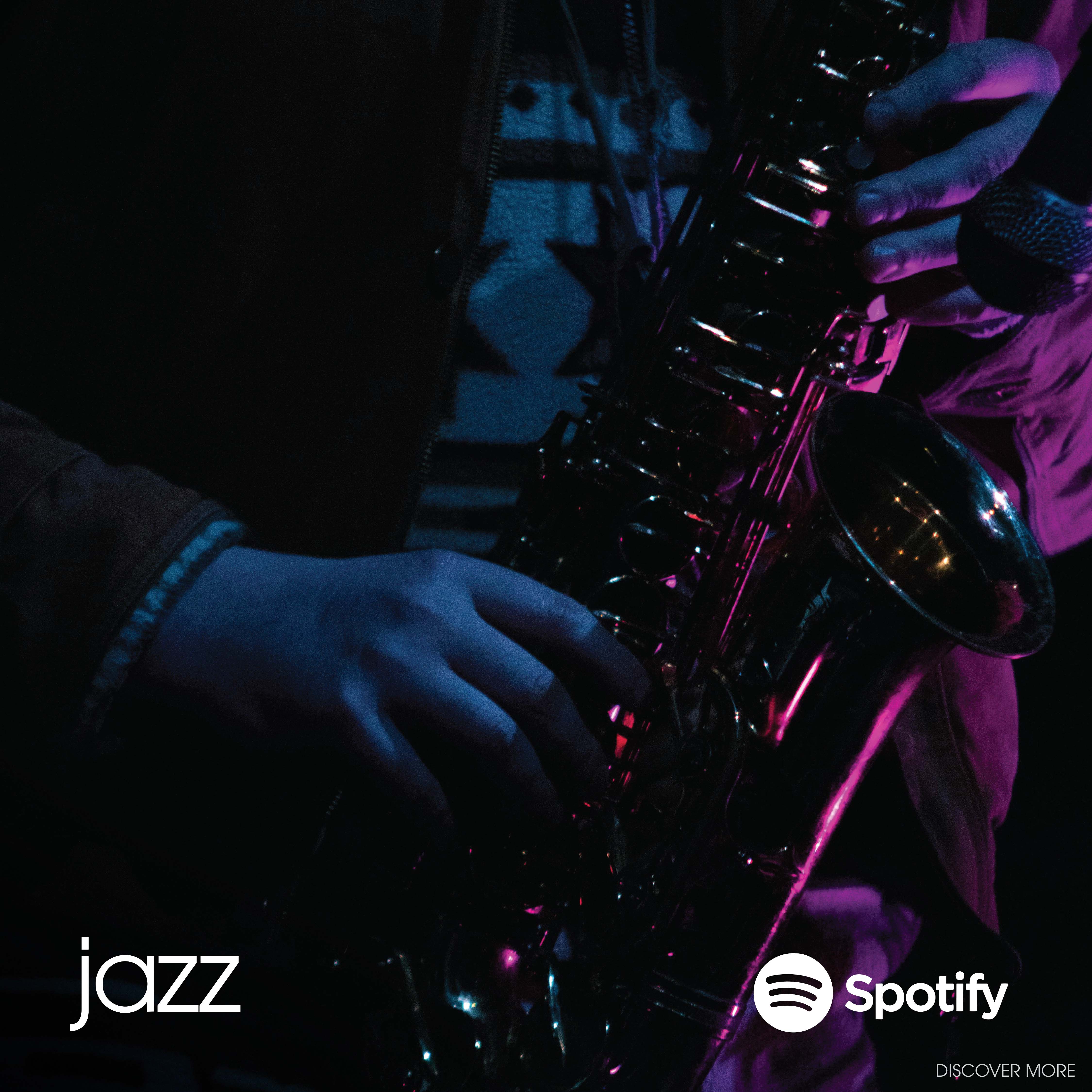
spotify
Spotify
Album Art | Poster Design | Type Design
Jazz is a visual rhythm, and designing Spotify album art means capturing its essence through fluid shapes, dynamic lines, and bold contrasts. Inspired by the genre’s improvisational nature, I incorporated abstract forms and vibrant color palettes that mirror the energy of a live performance—unpredictable yet perfectly in sync. Just as jazz bends notes and defies structure, my design blends classic elegance with a modern edge, reflecting the genre’s timeless evolution. More than just an album cover, it’s a visual symphony—where music and design meet in perfect harmony, bringing jazz to life on Spotify.
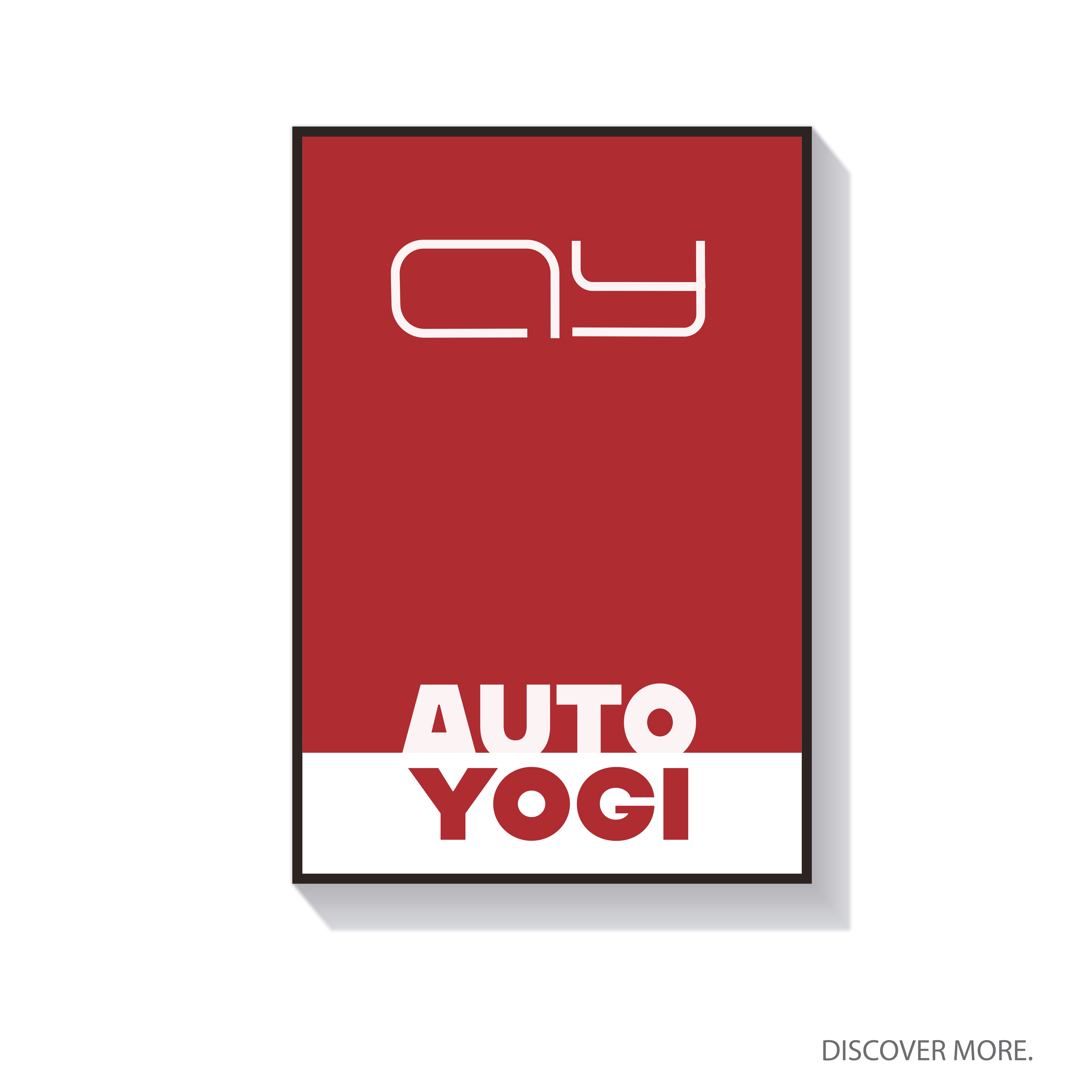
Auto Yogi
Auto Yogi
Monogram | Logo | Type Design
As a renowned Hindi-language YouTube auto journalist, Auto Yogi has built a strong community of car and bike enthusiasts who rely on expert insights, in-depth reviews, and unbiased analysis. To strengthen this identity, we set out to create a functional, impactful logo that represents the brand’s credibility and authority in the automotive world.
The new logo is designed to resonate with a global audience of auto enthusiasts, blending innovation with reliability. We envisioned a meaningful icon paired with a modern wordmark, symbolizing precision, balance, and clarity—core values that define Auto Yogi’s commitment to delivering trustworthy automotive content.
Beyond aesthetics, the logo reflects our mission: to empower, protect, and guide automotive brands and enthusiasts in an ever-evolving industry. Whether it’s breaking down the latest car technology or reviewing high-performance machines, Auto Yogi remains the go-to source for everything auto.
Teaco’s
Teaco’s: Artisan Teamaker
Monogram | Logo | Type Design | Packaging Design
Teaco’s embodies the pure essence of the Himalayas, delivering an immersive aroma and rich flavour that originates from the southern bank of the Brahmaputra River and the hills of Karbi. This exceptional tea is sourced from the historic Brit Tea Estate, established in 1856 by the British, and home to one of the highest-quality CTC (Crush, Tear, Curl) gardens in the region.
Grown in the foothills of the Himalayas, Teaco’s tea is cultivated under meticulously controlled temperature and moisture conditions, ensuring a bold, full-bodied brew with every sip. Whether you’re seeking a moment of tranquility or a revitalizing start to your day, this robust Himalayan tea offers an enchanting, otherworldly experience like no other.

Coca Cola
Motion Advertisement
Experience the power of visual storytelling with this Coca-Cola motion ad, a 13-second animated commercial designed by Bioscope Design Studio™. Created in 4K Ultra HD, this high-performance digital ad features fluid motion graphics, vibrant brand colors, and dynamic typography—perfectly tailored for global platforms like YouTube, Instagram Reels, and streaming services. This short-form branded content is optimized for high engagement, fast brand recall, and emotional impact, blending Coca-Cola’s timeless identity with modern animation techniques. Ideal for FMCG digital marketing, beverage advertising, and global brand campaigns.

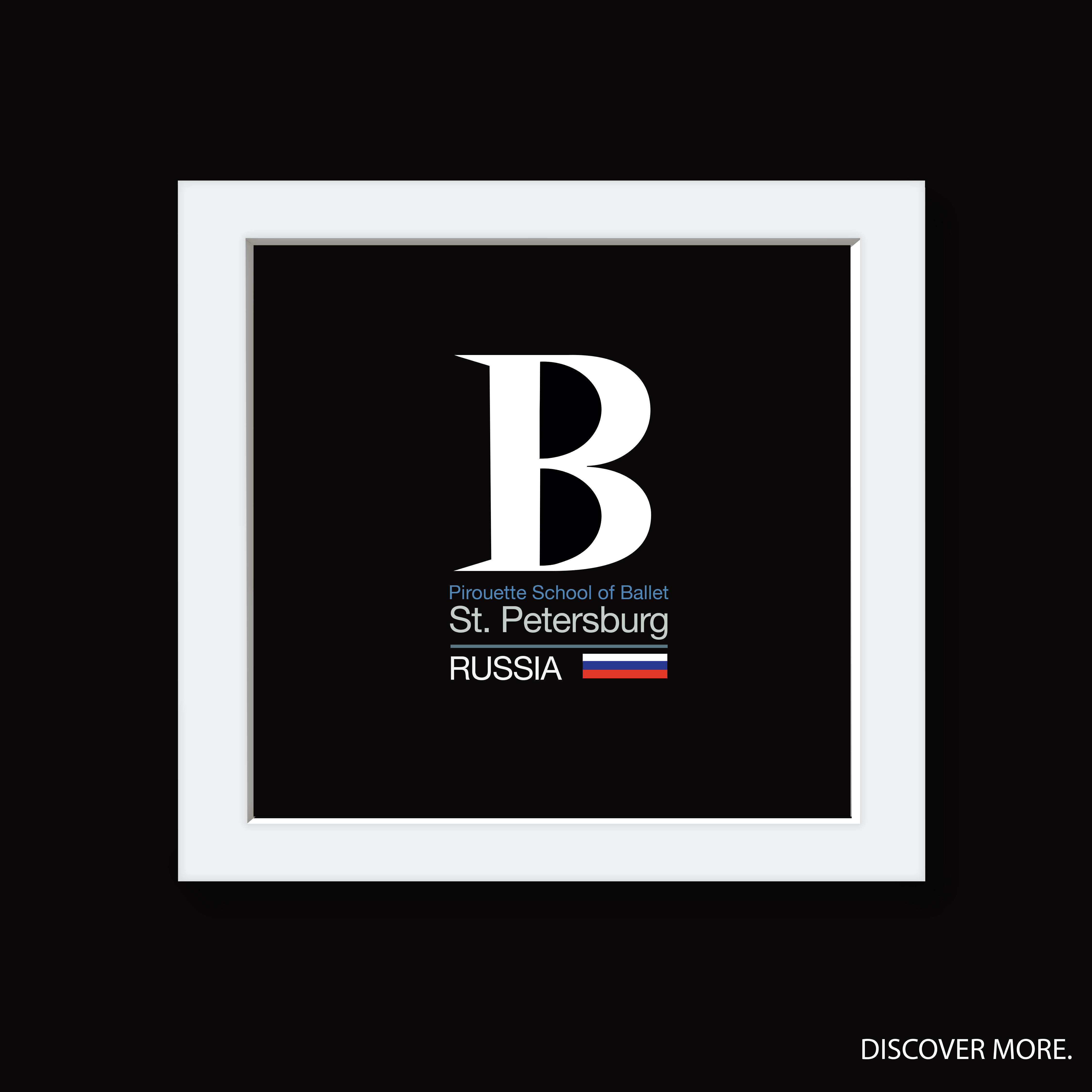
Ballet School
Pirouette School of Ballet
Logo | Type Design | Poster Design
Working on the brand identity for a Ballet School was one of the most promising and inspiring projects I’ve ever undertaken. Ballet is the perfect blend of grace, precision, and discipline, and my goal was to translate this elegance into a visual identity that truly embodies the art form.
Ballet in Russia boasts a rich 300-year history, standing as a national treasure and a cornerstone of Russian culture. Introduced by Peter the Great in the 17th century, ballet flourished under the influence of legendary figures like Marius Petipa and Sergei Diaghilev, whose contributions elevated Russian ballet to global prominence. What sets it apart is its unique fusion of classical techniques with Russian folk elements, resulting in performances known for their technical brilliance and deep emotional expression. Iconic institutions such as the Bolshoi Ballet and Mariinsky Ballet continue to shape its legacy, nurturing world-class talent and captivating audiences worldwide. Today, Russian ballet remains a symbol of artistic excellence, tradition, and innovation, celebrated across the globe.
Ground Up
Ground Up
Logo | Menu | Poster Design
When Ground Up approached me for their Holiday Season Logo, I knew this wasn’t just about creating a festive design—it was about capturing the essence of their brand while celebrating the warmth and joy of the season. Ground Up isn’t just a coffee shop; it’s a space where craftsmanship meets community, where every cup tells a story, and where passion for coffee is infused into every roast. Inspired by their commitment to quality, sustainability, and authenticity, I set out to design a logo that reflects their journey—one that blends the rich heritage of coffee with the festive spirit of the holidays. The challenge was to create something that felt both seasonal and timeless, seamlessly integrating into their existing brand identity. Through careful detailing, warm color palettes, and Scandinavian Design that resonate with their ethos, the final design embodies the heart of Ground Up—inviting, artisanal, and full of soul. This project wasn’t just about a logo; it was about telling Ground Up’s story in a new light—one that celebrates not just the holidays, but the people, the craft, and the love that goes into every cup they serve. Designing for a brand so deeply connected to its roots and its community made this a truly special experience, and I couldn’t be more excited to see it come to life.

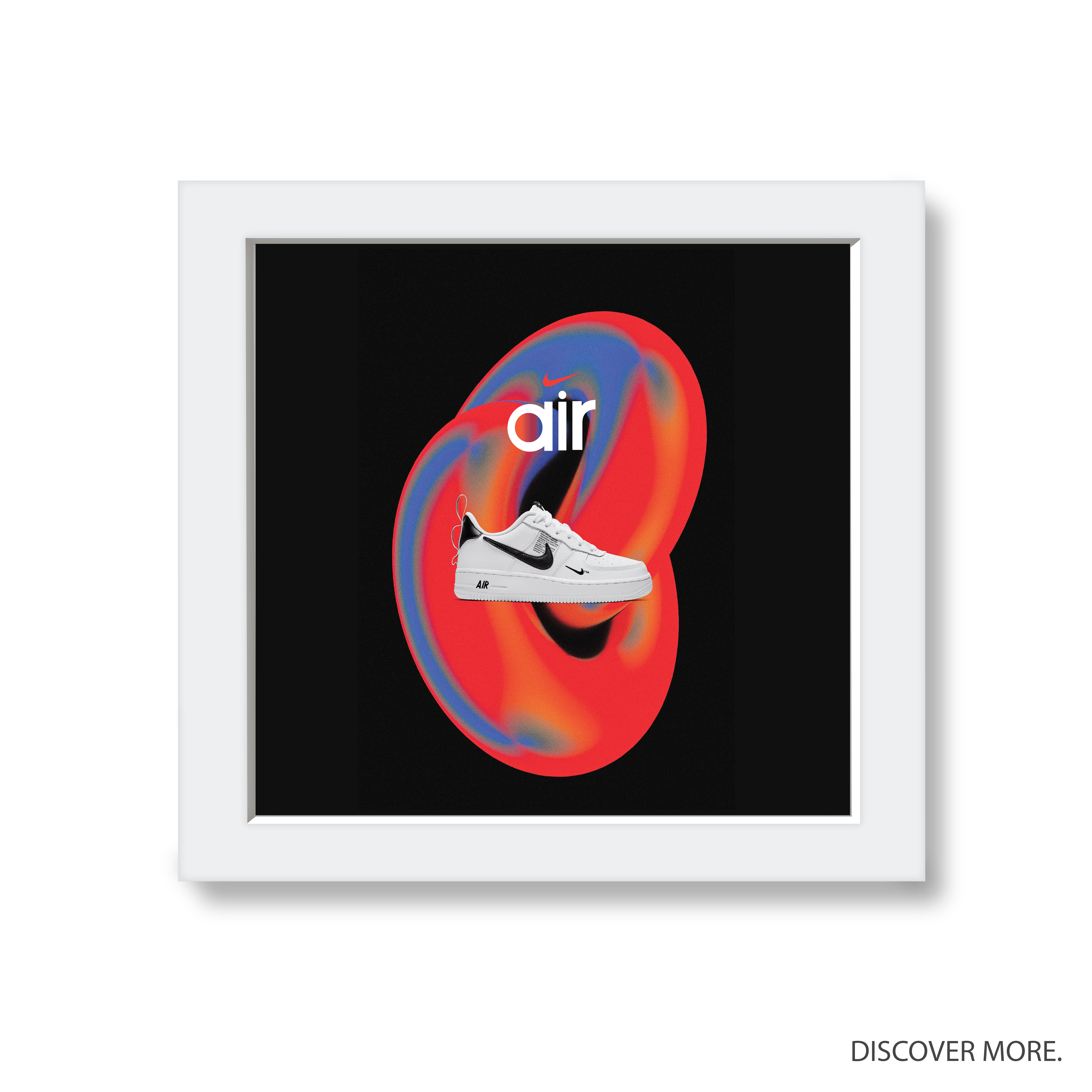
Nike
Nike Air, Nike.Inc.
Logo | Type Design | Poster Design
We Just Did It™
JUST LIKE THAT is a collective of talented designers and illustrators from around the globe, united by a shared passion for innovative and impactful design. Our latest project involved reimagining the iconic Nike Air Typo, viewing it through the unique creative lens of each artist. Through a dynamic collaboration between Behance and Nike, we pushed the boundaries of design, crafting a fresh and visionary interpretation of the brand. This project is a testament to the power of creativity, collaboration, and dedication, resulting in a design that both honors tradition and redefines the future. We’re excited to share one of these transformative creations with you—where art, culture, and innovation merge seamlessly.
Netflix
The Good Doctor, Netflix.
Logo | Type Design | Poster Design
I had the privilege of designing the logo and typeface for The Good Doctor, the acclaimed medical drama series on Netflix. My design work focused on creating a modern, professional visual identity that reflected the show’s core themes of empathy, inclusion, and personal growth. The logo and typeface were crafted to complement the story of Shaun Murphy, an autistic surgical resident, capturing both his challenges and triumphs. It was a rewarding experience contributing to a high-impact project that resonated with global audiences and enhanced the overall viewing experience of The Good Doctor.

The Queen’s Gambit
The Queen’s Gambit, Netflix.
Poster Design

The Queen’s Gambit is a critically acclaimed 2020 Netflix miniseries based on Walter Tevis’s 1983 novel of the same name. The series, created by Scott Frank and Allan Scott, follows the life of Beth Harmon, portrayed by Anya Taylor-Joy, a fictional chess prodigy who rises to prominence in the male-dominated world of chess during the 1950s and 1960s while battling personal struggles with addiction.
Overview
• Plot: The story begins with Beth as an orphan in Kentucky, where she discovers her talent for chess while living in an orphanage. After being adopted, she enters competitive chess tournaments, quickly gaining recognition but also facing challenges related to her drug and alcohol dependency. The series culminates in her participation in a prestigious international tournament in Moscow, where she confronts her greatest rival, Borgov.
• Themes: The narrative explores themes of feminism, addiction, and the complexities of genius. It highlights Beth’s journey from isolation to success, emphasizing her struggles with mental health and substance abuse as she navigates her chess career.
Upon its release on October 23, 2020, The Queen’s Gambit became Netflix’s most-watched scripted miniseries, receiving widespread acclaim for its storytelling, production quality, and Taylor-Joy’s performance. It won eleven Primetime Emmy Awards, including Outstanding Limited or Anthology Series, and two Golden Globe Awards.
The series has significantly increased public interest in chess, leading to a resurgence in the game’s popularity.
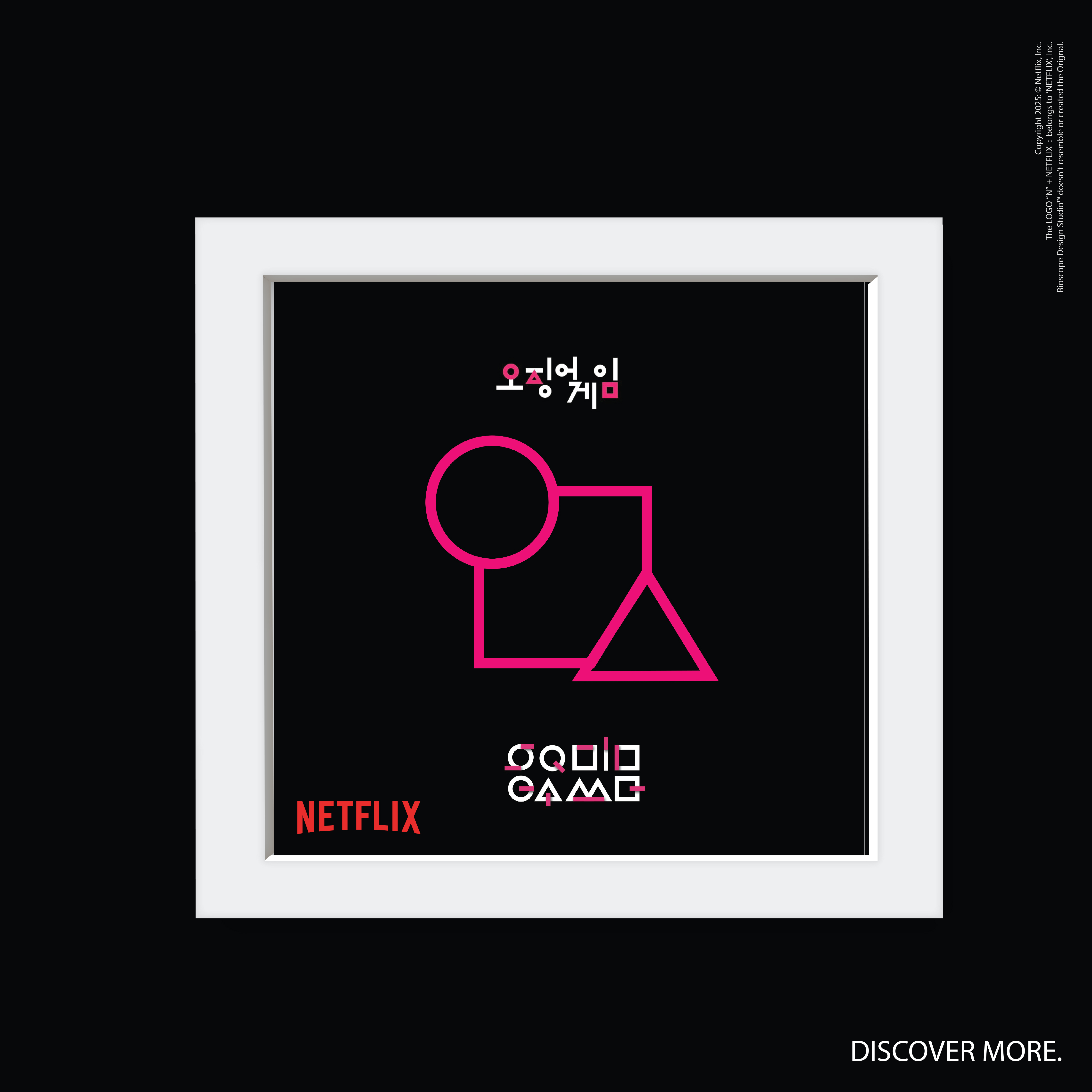
Squid Games 2
Squid Game 2, Netflix
Logo | Type Design | Poster Design
The logo, typeface, and poster design for Squid Game use geometric shapes—circle, triangle, and square—to represent the game’s power hierarchy. The circle symbolizes the lowest rank with minimal power, the triangle represents a higher status, and the square signifies authority as the highest rank. The sharp, minimalist typeface complements the design, emphasizing precision and tension. The bold use of shapes in the poster creates a dramatic atmosphere, reflecting the structured, high-stakes world of Squid Game. These design elements work together to reinforce the themes of control and hierarchy in the series.