The Heinz Story: From a Small Kitchen to a Global Icon.
In 1869, a young entrepreneur named Henry J. Heinz started selling horseradish in clear glass bottles—proof of purity in an era of questionable food quality. But it wasn’t until 1876 that he introduced Heinz Tomato Ketchup, a thick, flavorful sauce made from ripe tomatoes, vinegar, and spices. Unlike the watery, artificial ketchups of the time, Heinz perfected a rich, slow-pouring recipe that soon became a staple in American households.
With the slogan “57 Varieties”, Heinz built more than just a brand—he created a symbol of trust and quality. By the early 1900s, Heinz Ketchup was being exported worldwide, making its way into diners, restaurants, and kitchens across Europe and Asia. The iconic glass bottle, known for its slow, satisfying pour, became a mark of patience and perfection.
Over the decades, Heinz expanded beyond ketchup, producing mustards, relishes, and sauces, while staying true to its commitment to real, natural ingredients. In 2015, Heinz merged with Kraft, creating one of the biggest food companies in the world.
Today, whether it’s squeezed onto a burger in New York, drizzled on fries in London, or added to a samosa in Mumbai, Heinz remains the gold standard of ketchup—because great taste never goes out of style.


Case Study : Heinz Ketchup Branding
by BIOSCOPE DESIGN STUDIO™
Project Overview
Heinz, a globally recognized brand synonymous with quality ketchup, is known for its rich heritage and strong visual identity. The goal of this design project was to create an innovative and visually compelling representation of Heinz’s brand values, emphasizing freshness, authenticity, and premium quality.
Design Concept & Inspiration
The design revolves around the idea of freshness and natural ingredients, reinforcing Heinz’s messaging that its ketchup is made from the best tomatoes. The aesthetic direction highlights:
• A bold, clean, and modern composition that captures attention.
• Vibrant red hues, symbolizing ripe tomatoes and Heinz’s signature ketchup.
• Dynamic motion of splashing ketchup, evoking a sense of energy and taste appeal.
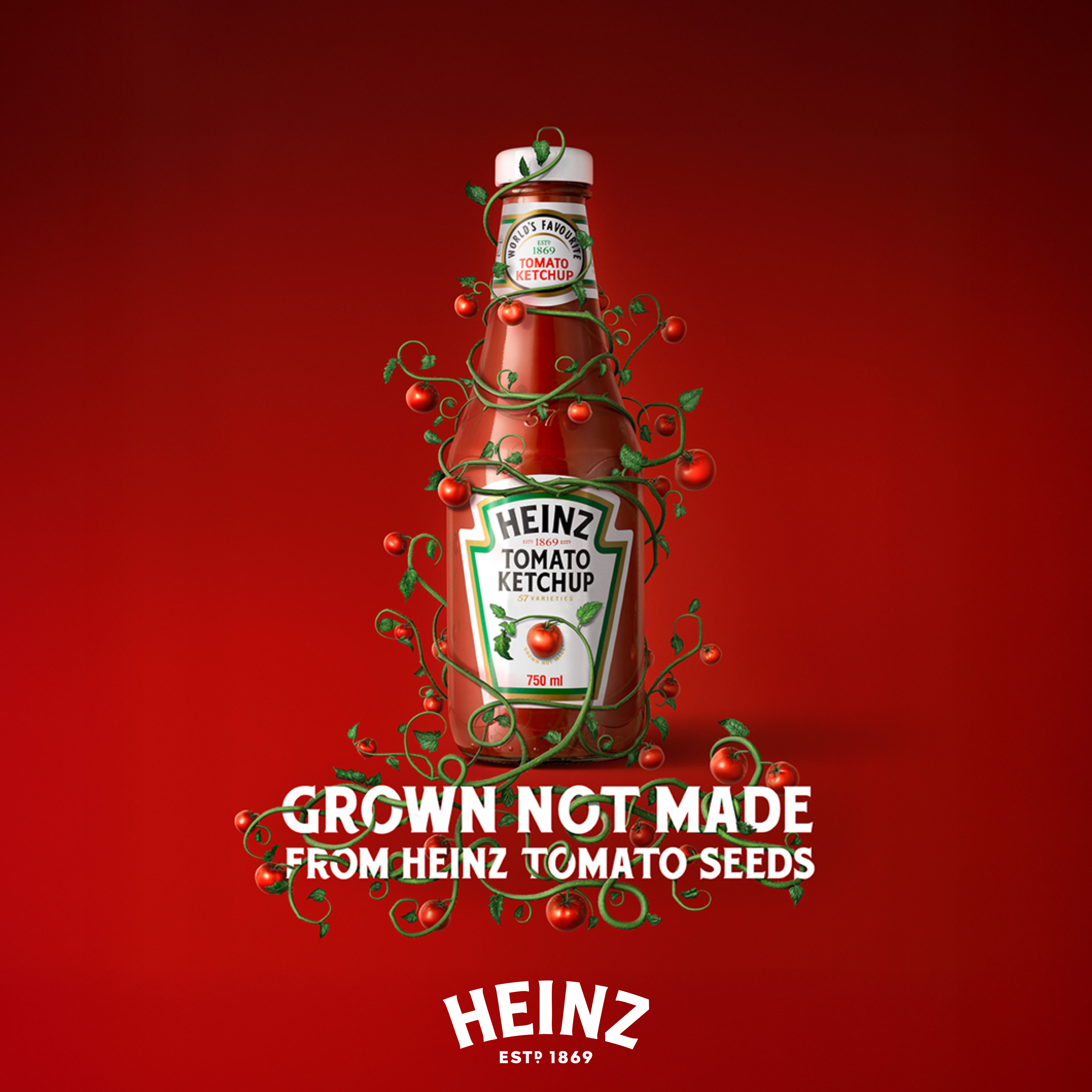
• Organic elements such as whole and sliced tomatoes, reinforcing the “Grown Not Made” tagline.
Key Design Elements
1. Heinz Label as the Focal Point
• The classic Heinz label was kept intact to maintain brand recognition.
• It serves as the anchor of the composition, ensuring brand consistency.
2. Surrounding Tomato Elements
• Whole and sliced tomatoes are positioned dynamically to create depth.
• The fresh tomatoes emphasize Heinz’s farm-to-table quality.
3. Ketchup Splashes & White Background
• The fluid ketchup splashes add movement and excitement.
• A clean white background makes the elements pop while maintaining a premium look.
4. Typography & Branding
• The official Heinz typeface was preserved to align with brand standards.
• The text placement ensures readability and strong brand recall.
Challenges & Solutions
• Challenge: Maintaining Heinz’s brand integrity while introducing a fresh perspective.
Solution: A careful balance of traditional elements (logo, typography) and modern visuals (dynamic composition, fresh produce).
• Challenge: Creating an eye-catching yet clean design that works across digital and print.
Solution: A well-thought-out color contrast and high-resolution rendering for scalability.
Impact & Takeaways
This design successfully:
• Enhances Heinz’s premium brand perception.
• Communicates freshness and authenticity.
• Engages audiences with a visually stimulating yet familiar approach.
• Strengthens Heinz’s core brand message: “Grown Not Made.”
Final Thoughts
This project showcases how strategic design can reinforce a brand’s core values while keeping it fresh and engaging. BIOSCOPE DESIGN STUDIO™ has crafted a compelling visual that not only aligns with Heinz’s legacy but also elevates its modern-day branding.